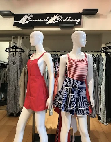
Current Clothing is a local SF contemporary clothing boutique located in the Marina district of San Francisco, California. Founded in 2014, this boutique mainly advertises its many products through their Instagram handle and keeps a low-profile on their official website. Unfortunately, the lack of attention on their site shows through: unclear navigation bar, cluttered homepage, lack of filters for products, no promotions/sales content, and many more.
PROJECT DETAILS
My Role: UX/UI Designer
Team: Solo Project
Tools: Paper, Pen, Flipcharts, Whiteboard, Sticky Notes, Sketch, InVision
Design challenge
Redesign an e-commerce site of a local boutique in San Francisco, CA.
STYLE GUIDE
WHO ARE THE COMPETITORS?
The Current Clothing boutique prides itself by keeping their store open later than other boutiques in the neighborhood. However, staying open for a longer time is not enough when competing online.
To see what strategies other contemporary e-commerce sites were taking to showcase their products, I looked into Gap and Urban Outfitters.
Both GAP and Urban Outfitters have:
Minimalistic design
Visible and highlighted brand logo
Loves List
USER INTERVIEWS & FINDINGS
Inside Current Clothing boutique
To get a better understanding of the boutique’s culture and store presence, I went to take a look inside in hopes of meeting the owner/manager and speak to some shoppers. To my delight, I found a bright-eyed woman behind the cash register who introduced herself as Bailey, the store manager and a few shoppers browsing the store. I proceeded to speak with and observe Bailey and the other shoppers during my hour long visit.
User Interview & Contextual Inquiry findings:
Demographics are 95% women
Most shoppers are local to the neighborhood
More traffic in the store around evening
Less than half the people leave the store with a purchase
Many women come in for wedding-guest dresses as well as music festival wear
PERSONAS
Interviewing the shoppers and managers gave me a clear vision on what type of users shop at Current Clothing. See below their profile but pay special attention to Lauren Rohde who is the main and primary persona- she’s in her 30s, successful in her career and lives in the same neighborhood as the boutique.
PROBLEM
Users find themselves frustrated and wasting time because they are unable to find clothes in their size and price range because of the lack of basic filter features to narrow down the product options.
SOLUTION
This redesign will now enable users to add a filter to their searches which will decrease frustration and time spent to find a desired product. This will, in turn, grow more sales for the company.
INFORMATION ARCHITECTURE
As mentioned above, I compared Current Clothing’s IA for the navigation bar with two other contemporary clothing e-commerce sites: GAP and URBAN OUTFITTERS.
CURRENT CLOTHING
GAP
URBAN OUTFITTERS
Both GAP and Urban Outfitters have:
Clear Navigation Bar with dropdown features for each category
Clear Search Bar
Visible and highlighted brand logo
CARD SORTING
After comparing the competitors sitemap with Current Clothing, it was apparent that the latter needed a redesign to effectively guide users in navigating through different types of clothing items.
SITEMAP
The card sorting resulted in adding a drop down menu for each category contrary to the original sitemap. See below for the difference:
OLD SITEMAP
NEW SITEMAP
SKETCHES & WIREFRAMES
Before digitizing my ideas, I hand-sketched the redesign for Current Clothing’s homepage and then moved on to building low fidelity wireframes and high fidelity wireframes. See below the comparison between the original site and the (select) redesigned pages:
Hand sketch for homepage
Block wireframe for homepage
comparison between Original and Redesign
HOMEPAGE
Redesign: Lo-fidelity wireframe for Homepage (Tops dropdown in view)
Redesign: Hi-fidelity wireframe for Homepage (Tops dropdown in view)
PRODUCTS PAGE
Redesign: Lo-fidelity wireframe for Products page
Redesign: Hi-fidelity wireframe for Products page
ITERATIONS
As users gave their feedback, I iterated multiple times. See below for some of the iterations for homepage; shipping, billing, & payment; and account login page.
HOMEPAGE
Shipping, Billing & Payment Page
ACCOUNT LOGIN PAGE
Continuous usability testing produced some thoughtful feedback and suggestions on improvement. Starting from the hand sketch to the high fidelity prototypes, I had 7 users who participated in testing my redesign. Find Iterated screens under the Iterations section.
FINDINGS
On hand sketch
Instagram pictures are distracting and not necessary
“How can we help you” can be removed to avoid overcrowding on the footer
Add social media links near contact information
Lo/Hi-fidelity
For homepage
Remove “Browse” under Collections in Homepage as it leads to none of the categories - instead make each box clickable
For shipment page
Remove multiple submit buttons
Only show one tab during Shipment process (both screens open are confusing)
Account login page
Add a “exit” button to enable the user to exit out at any time
The final hi-fidelity prototype shows a clear user flow from product discovery to checkout. Another user flow that I briefly showed was how to log in to the user account but also promptly exiting to show it’s not necessary for purchasing.
Overall, this redesign has made me realize how important it is for e-commerce sites to appeal to their target audience. Being a small boutique means that many folks visited the store by being nearby or simply, chance- this meant for more of an in-store experience rather than an online one.
Next steps for this redesign would be to produce a visual composition of the high fidelity wireframes and find a Developer to code the redesign.


