MyZio App 2.0 Redesign
MyZio® is the companion app for patients using the Zio ECG monitor, offering features like digital symptom tracking, educational resources, and timely reminders throughout the monitoring process.
Overview
MyZio 2.0 was a company-wide redesign of a patient-facing cardiac monitoring app, where usability, accessibility, and trust directly impacted clinical outcomes.
The existing experience was clinically accurate but difficult for patients, especially older users, leading to incomplete symptom data, increased support calls, and lower patient compliance.
I co-led this project with one other product designer, and owned redesigning the highest-impact patient flows — symptom logging, device management (under profile & settings), and help & education — balancing clinical requirements, accessibility standards, and real-world patient behavior.
Impact
Simple press of the monitor to update Zio when having any symptoms or unwell feeling.
App Store ReviewSo much easier than carrying a booklet around to log my symptoms! This app has been great, very easy to use.
App Store ReviewThe interface with the app couldn't be easier.
App Store ReviewI'm so thankful for this app.. my arrhythmia happens so often that logging every time I have an irregularity is quite inconvenient but the app makes the process so much easier, faster and more efficient.
App Store ReviewEasy to navigate this app. I really appreciate this convenient tool instead of trying to remember to take the 'booklet' with you...Senior approval!!
App Store ReviewThe app makes the process so much easier, faster and more efficient.
App Store ReviewMyZio 2.0 promotional video showcasing the redesigned symptom logging experience.
Background & Challenge
The MyZio app (v1.5) felt cold and clinical — not exactly what you want when you're a patient managing heart health. For older adults (the median age of an iRhythm patient is 62), the app created more stress than support. Symptom logging was confusing, the interface didn't meet accessibility standards, and the whole experience felt like it was designed for doctors, not the people actually wearing the device. MyZio 2.0 was our chance to flip that. We reimagined the app from the ground up, focusing on what patients actually needed: clear, simple tools that made symptom tracking effortless and an interface that worked for everyone — including those with vision challenges or lower tech comfort.
Before
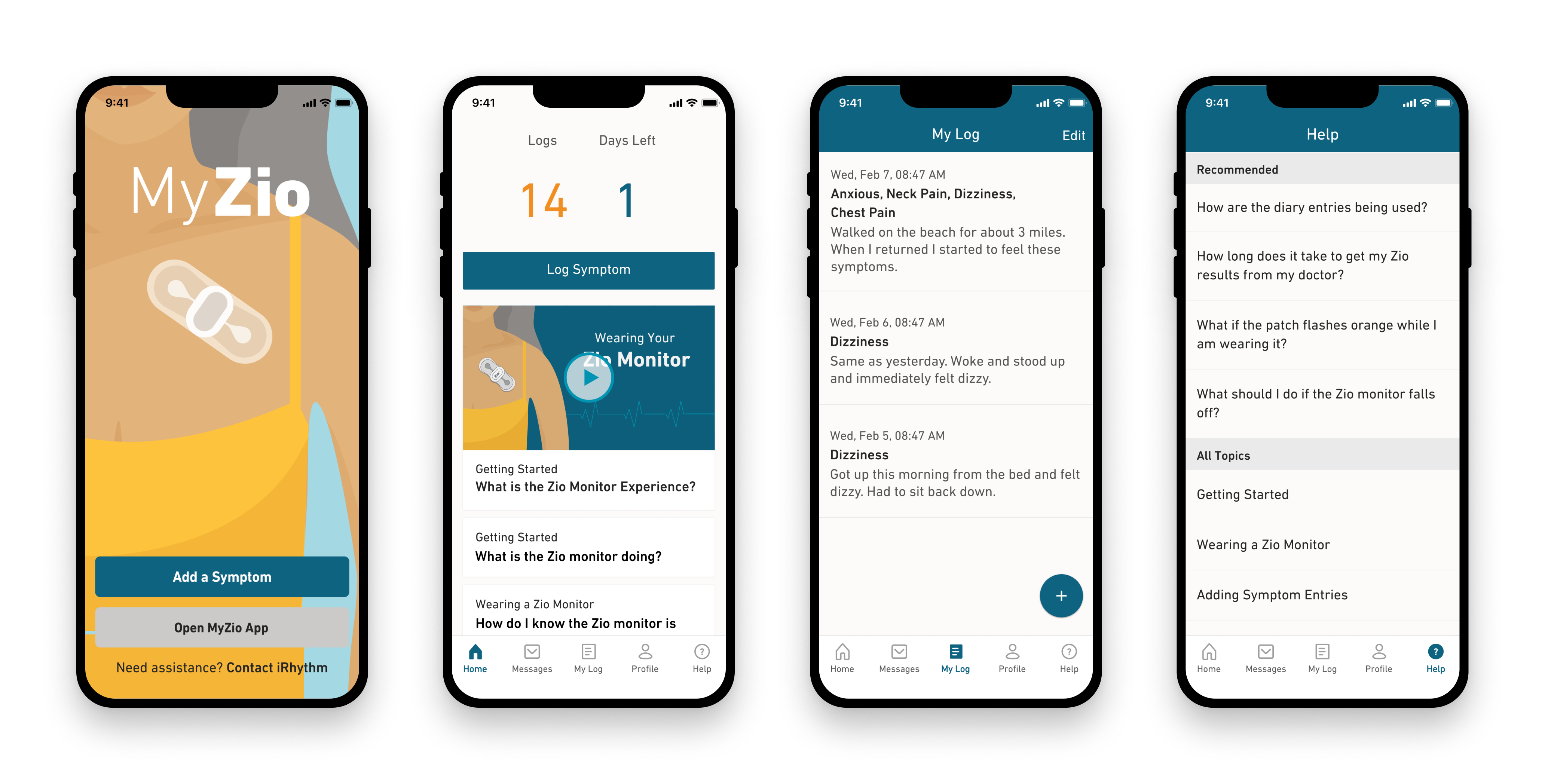
The original MyZio app (v1.5) — a clinical interface that prioritized data density over patient usability.
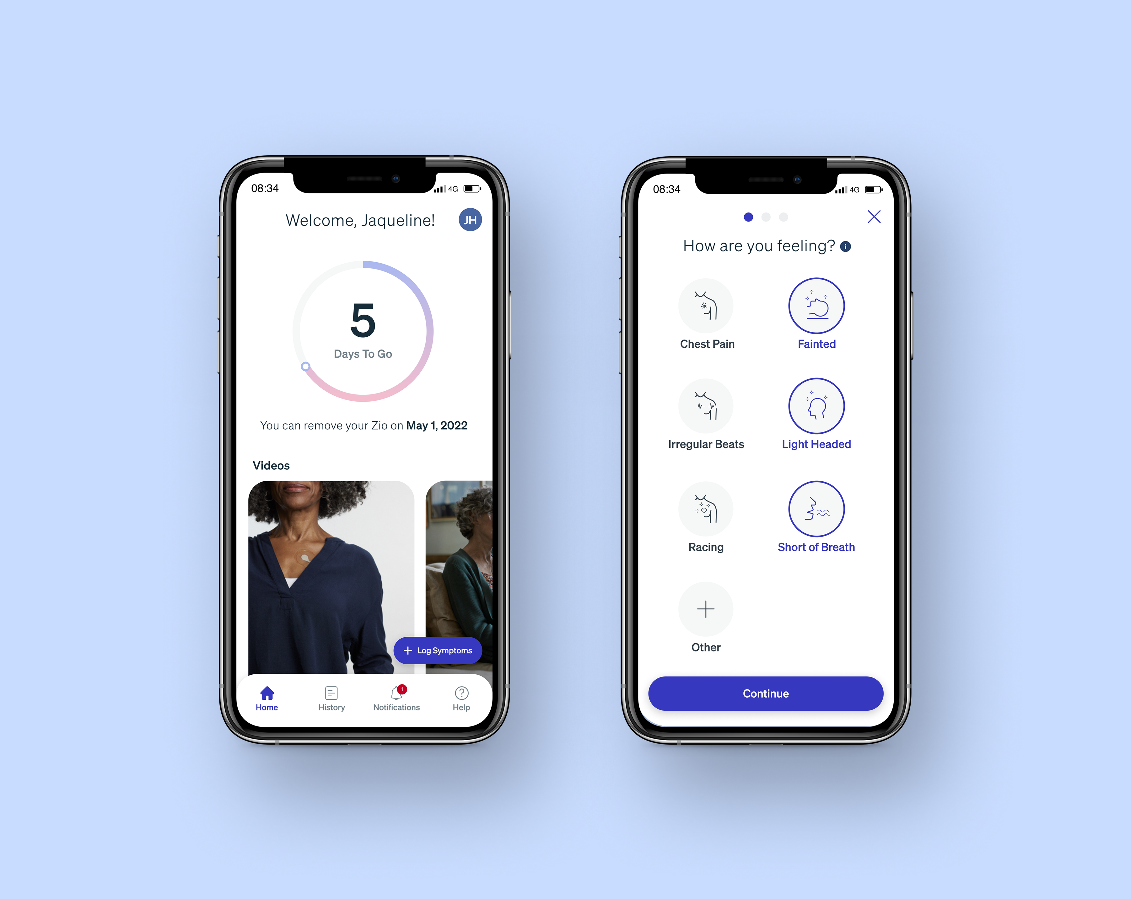
After
Final designs across the MyZio app's core patient touchpoints.
User Research
Research Insights
Partnering with Researchers, Product Managers, and Engineers, we identified critical pain points through usability studies and customer care analysis:
Symptom Logging Issues
- Confusing dual-action process (button press + app entry)
- 7-step flow with too many required fields caused high abandonment
- Patients forgot to complete both steps or skipped logging entirely
- No feedback confirmation — unclear if symptoms were logged successfully
Broader Product Issues
- Clinical design felt cold and unwelcoming
- Accessibility gaps excluded vision-impaired users (low contrast, small touch targets)
- High volume of support calls overwhelming customer care team
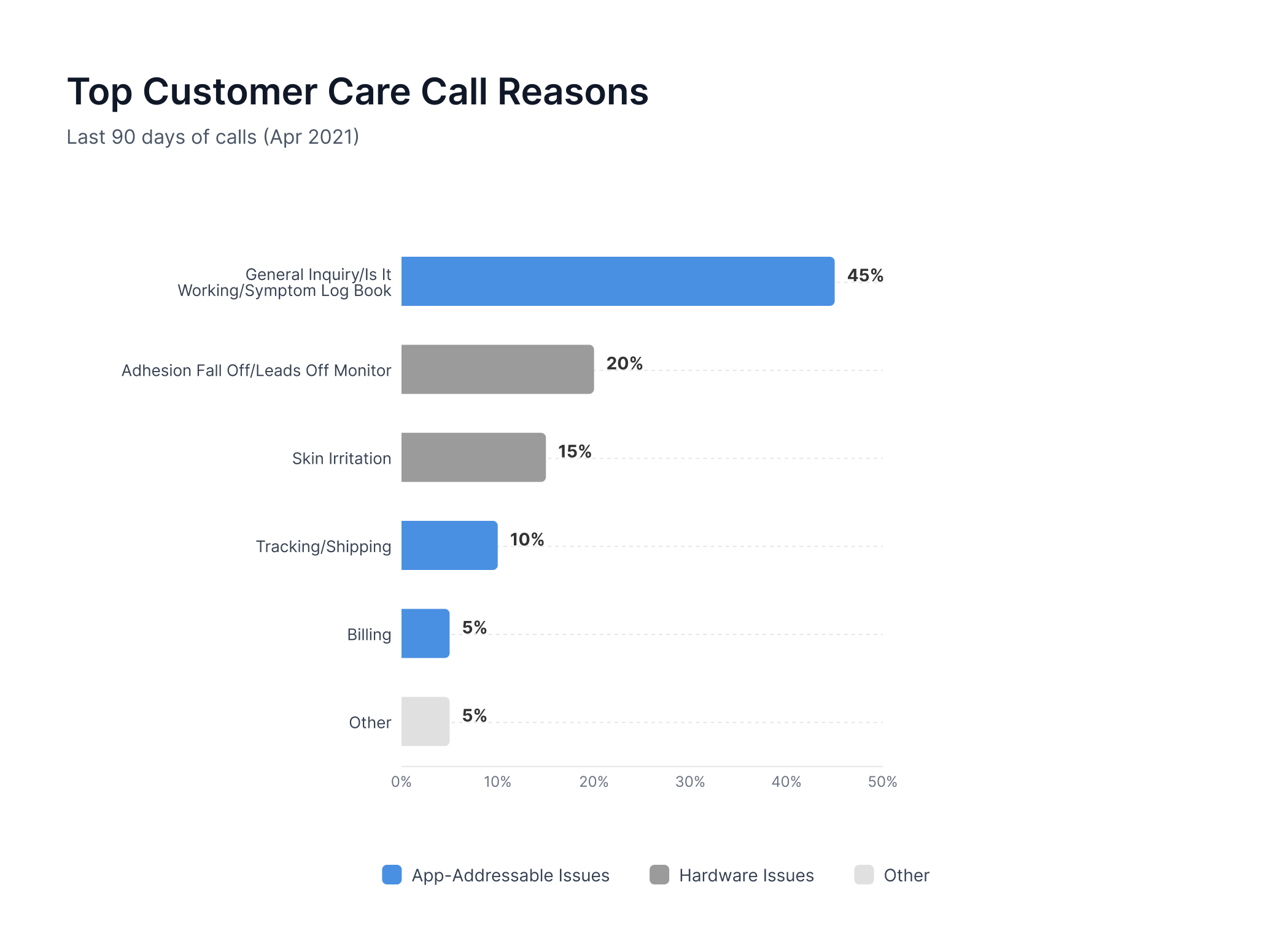
High customer care call volume driven by confusing symptom logging and device setup flows.
My Role & Approach
My Ownership
I led three high-impact areas:
- Symptom logging — highest diagnostic impact, simplified the flow from 7 steps down to 4 to stop patients from dropping off mid-task
- Profile & Settings — monitor management and patient data
- Help & Education — reducing support burden and ensuring consistency between web and mobile experience
Championing Accessibility
Here's the thing: Accessibility got deprioritized after some leadership changes early on, but I believed it was critical to our users so I ran my own accessibility audits throughout the project, made sure our text contrast and readability were solid, and kept advocating internally until we secured buy-in (and budget) for a formal accessibility vendor to take it even further.
Cross-Functional Alignment
I also spent a lot of time aligning with cross-functional partners such as Product Managers, Engineers, Legal, Regulatory, and Marketing to make sure we could deliver a fresh, rebrand-aligned experience without getting stuck in compliance or roadmap issues.
The Solution
Visual Design
Implemented company-wide brand refresh with lighter, accessible colors and modern typography — shifting from clinical to patient-friendly while meeting WCAG 2.1 AA standards.
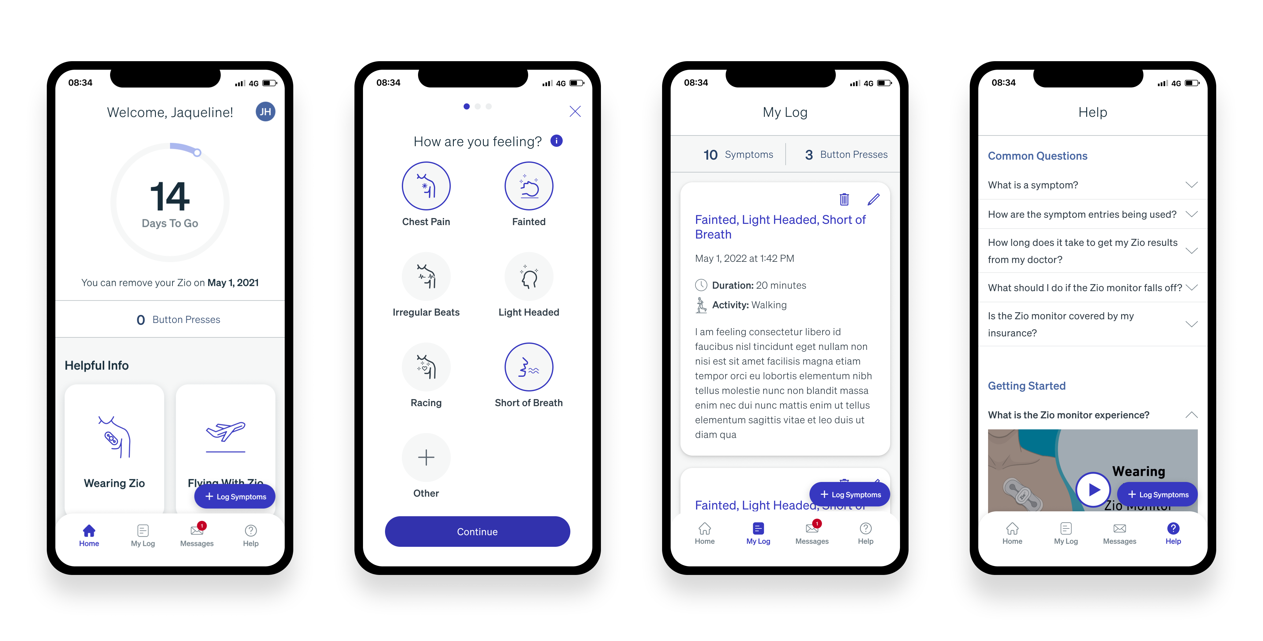
My Log
The symptom logging and editing flow is redesigned to be faster, cleaner, and more accessible — reducing 7 steps to 4 when adding a symptom and replacing the cumbersome multi-screen editing process with a streamlined, guided flow.
Adding Symptoms (Overview)
The redesigned symptom logging flow — reduced from 7 steps to 4.
Adding Symptoms (Deep Dive)
Detailed view of the symptom log iterations.
View Symptom Log Prototype ↗Editing Symptoms (Overview)
The streamlined editing flow — a unified journey replacing the fragmented multi-screen experience.
Symptom Card Designs (New Feature)
Designed three card states to communicate monitor status and data type at a glance.
Three card states: collapsed default, expanded detail, and inactive monitor indicator.
Key Changes
Profile & Settings
Simplified flows by grouping related functions for easier scanning, reimagined an intuitive flow for adding a new monitor and created a new pathway for viewing current and previous devices.
Profile & Settings (Overview)
Reorganized into 4 clear sections — About Me, My Zio, Account, and Help — for improved scannability.
Key Changes
Register New Device (Overview)
Simplified 3-step registration with barcode scanning, eliminating error-prone manual serial number entry.
Key Changes
Help & Education — Cross-Platform Design
Redesigned to be scannable and action-oriented, reducing customer support calls by making answers easier to find.
Mobile Experience (Overview)
Redesigned mobile help experience with accordion-style FAQs — answers expand inline without leaving the page.
Web Experience (Overview)
Web counterpart using the same accordion pattern — consistent experience across platforms.
Key Changes
Cross-Platform Collaboration: Collaborated with Marketing Engineering to implement consistent accordion pattern across mobile app and iRhythm.com.
Future Enhancement: Advocated for search functionality in mobile app to improve accessibility (reducing scroll time for vision-impaired users) but it was scoped for future release due to roadmap constraints.
Trade-offs
The Completion vs. Detail Tradeoff
Stakeholders wanted comprehensive symptom data. I advocated for reducing required fields to prevent abandonment. We shipped with fewer fields and saw 4.3× higher completion rates.
✅ Result: 4.3× higher completion rates
The Accessibility vs. Stakeholder Requests Tradeoff
Clinical team requested more on-screen information. I prioritized WCAG-compliant visual hierarchy, even when it meant removing secondary content. Result: accessible to all users.
✅ Result: Accessible to all users
The Reliability vs. Innovation Tradeoff
Focused on core functionality and regulatory compliance first, scoping advanced features (search, personalization) for future releases to meet timeline constraints.
✅ Result: On-time, compliant delivery
The Breadth vs. Depth Tradeoff
Rather than perfecting accessibility in one area, I championed baseline improvements across the entire app. Result: all users benefited, not just users of specific features.
✅ Result: App-wide accessibility lift
Reflection
This project reinforced how critical clarity and restraint are when designing for patients managing serious health conditions. Reducing cognitive load and interaction cost had a direct impact on data quality and patient compliance — often more than adding additional clinical detail.
One challenge was that foundational research had already been completed before I joined the project. While this limited early-stage discovery, it sharpened my focus on iterative validation, particularly within the symptom logging flow. If I were to approach this project again, I would advocate for more frequent, lightweight testing throughout the redesign — even within tight timelines — to continuously validate assumptions as complexity increased.
This work also deepened my conviction that accessibility must be treated as core product quality, not a secondary consideration. Despite moments where accessibility was deprioritized, continuing to advocate for audits, contrast improvements, and readable typography ultimately led to executive buy-in and long-term investment in WCAG compliance. That experience strengthened my ability to influence cross-functional partners and leadership around user needs that may not be immediately visible, but are critical to trust and adoption.
Overall, MyZio 2.0 shaped how I approach complex, regulated products: prioritizing the moments that matter most, designing for real-world use under stress, and making principled tradeoffs in service of both users and the business.
© 2021–2023 iRhythm Technologies. All product work shown is my own and shared for portfolio purposes only.