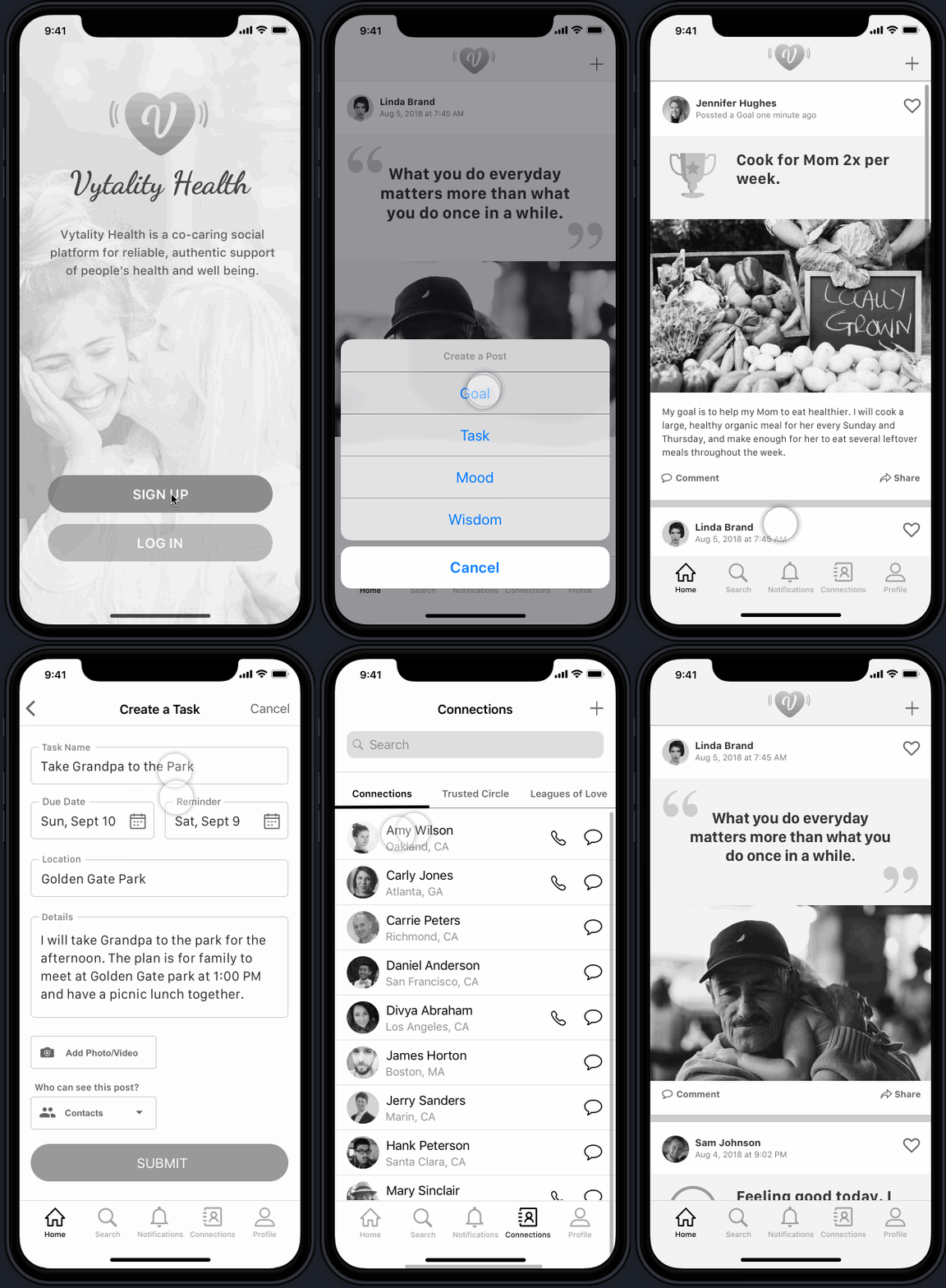
At its core, Vytality Health is a “co-caring” social community app that provides reliable, authentic support while improving well being and positive healthy social behaviors. How does it do this?
By posting a goal, task, mood or wisdom note that appears on friends’ timelines which encourages engagement, creates a sense of belonging, and provides emotional and physical support
Every post type brings a unique experience to the individual in need, e.g. when creating a goal “read 20 books by the end of this year,” the user is able to set a reminder, and control the privacy of the post- Vytality Health encourages users to post goals publicly as the trusted social community provides accountability and support in achieving goals.
PROJECT DETAILS
My Title: UX/UI Designer & Project Manager
Team: 3 UX Designers and 1 UX Designer & Project Manager
My role: Project management; Defining target users; Interviewing users and sending out surveys for qualitative and quantitative data, respectively; Creating personas; Sketching, and building wireframes for Onboarding, Homepage/Feed, and Messages; Rapidly prototyping; Conducting usability testing; and Iterating multiple times
Tools: Pen, Markers, Paper, Whiteboard, Sticky notes, SurveyMonkey, Sketch, Invision, Licecap, and Trello
DESIGN CHALLENGES
Vytality Health wanted us to:
1) Conduct user validation research
2) Build the foundation on how people support their own and other's goals.
We followed the Standford d.school Design Thinking throughout the design process
Timeline from Research to Client Presentation
STYLE GUIDE
Who are the competitors?
To get a better understanding of what is already out there in terms of caring apps, we turned to our competitors and analyzed their features. We looked into Lotsa Helping Hands, Carely, Kinto and Caregivers in the Community.
Most apps focus on medications, and other daily health tracking OR coordinating and helping organize daily caregiving tasks.
Most common features: Profile, Contact Management, Closed Group management, Commenting, and Task Management.
Opportunities:
Community engagement in this space is lacking.
Gamification is not typical of this app space. If you can incorporate it smartly, it will greatly help engagement.
Keeping in mind that this app is a social community app, we compared features from other social apps to get an idea of what features would enhance the social community experience for our users. We looked into Instagram, Facebook, OkCupid, and Rover.
Newsfeed with images, statuses, quotes, and more
Explore function that matches you with profiles/posts of interest
Profile completed by self-descriptions and preferences
Opportunities:
Many use the function of sharing but enjoy the privacy as well
An engaging feed on homepage keeps users interested
USER INTERVIEWS & FINDINGS
Our client provided us with a list of people we could interview but the target user type was too general. After conducting a total of 13 in-depth user interviews and 7 surveys (for both quantitative and qualitative data), we were able to put the target users in two categories: Caregivers and Care-receivers.
“I’d love emotional support from others whether they’re friends or strangers - when I’m feeling sick, emotional support is 100% helpful.”
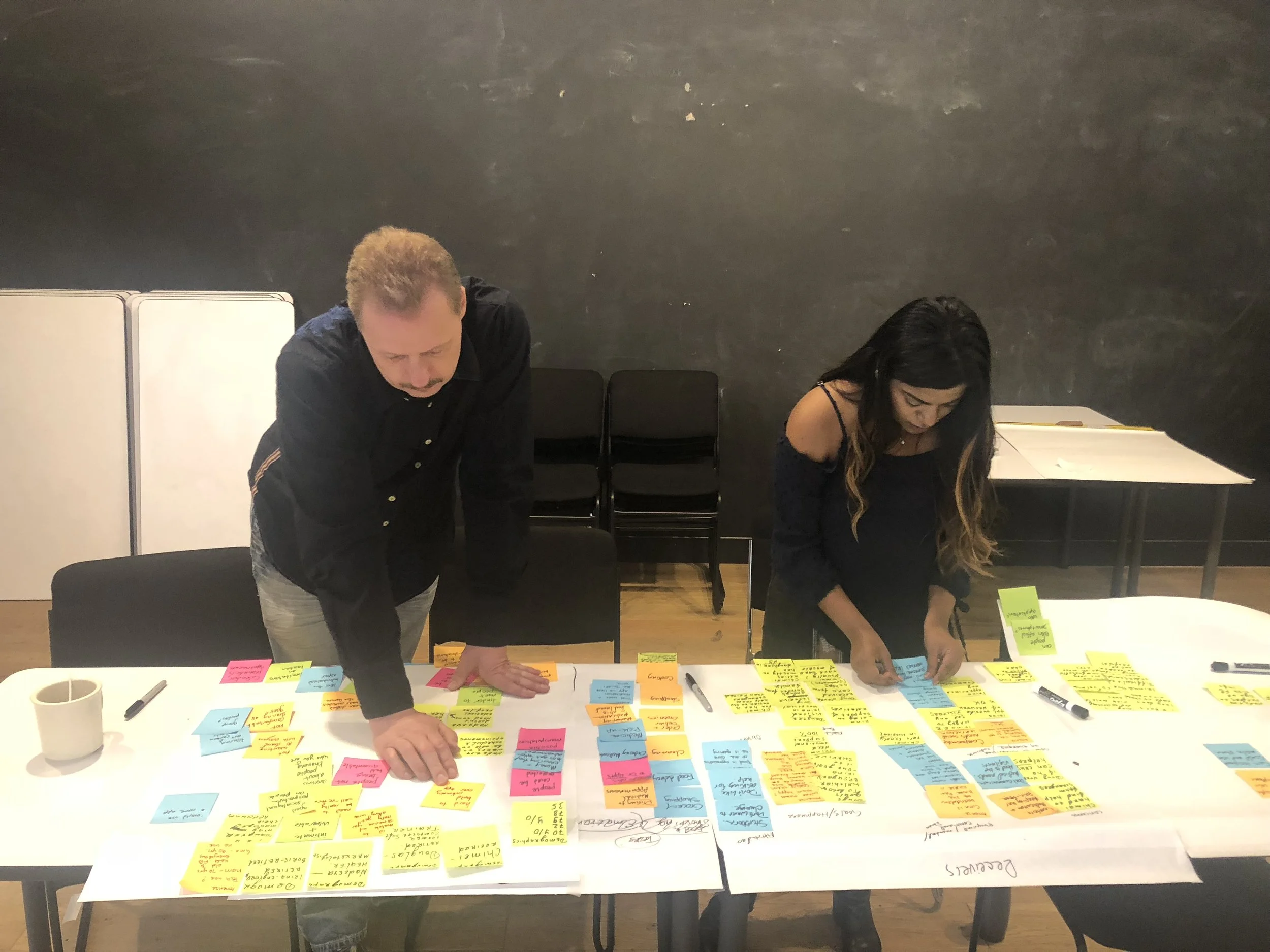
Once all the data was gathered, we proceeded to affinity map to uncover the patterns and trends from our users. We were finally able to discover their pain points, challenges and delights.
PERSONAS
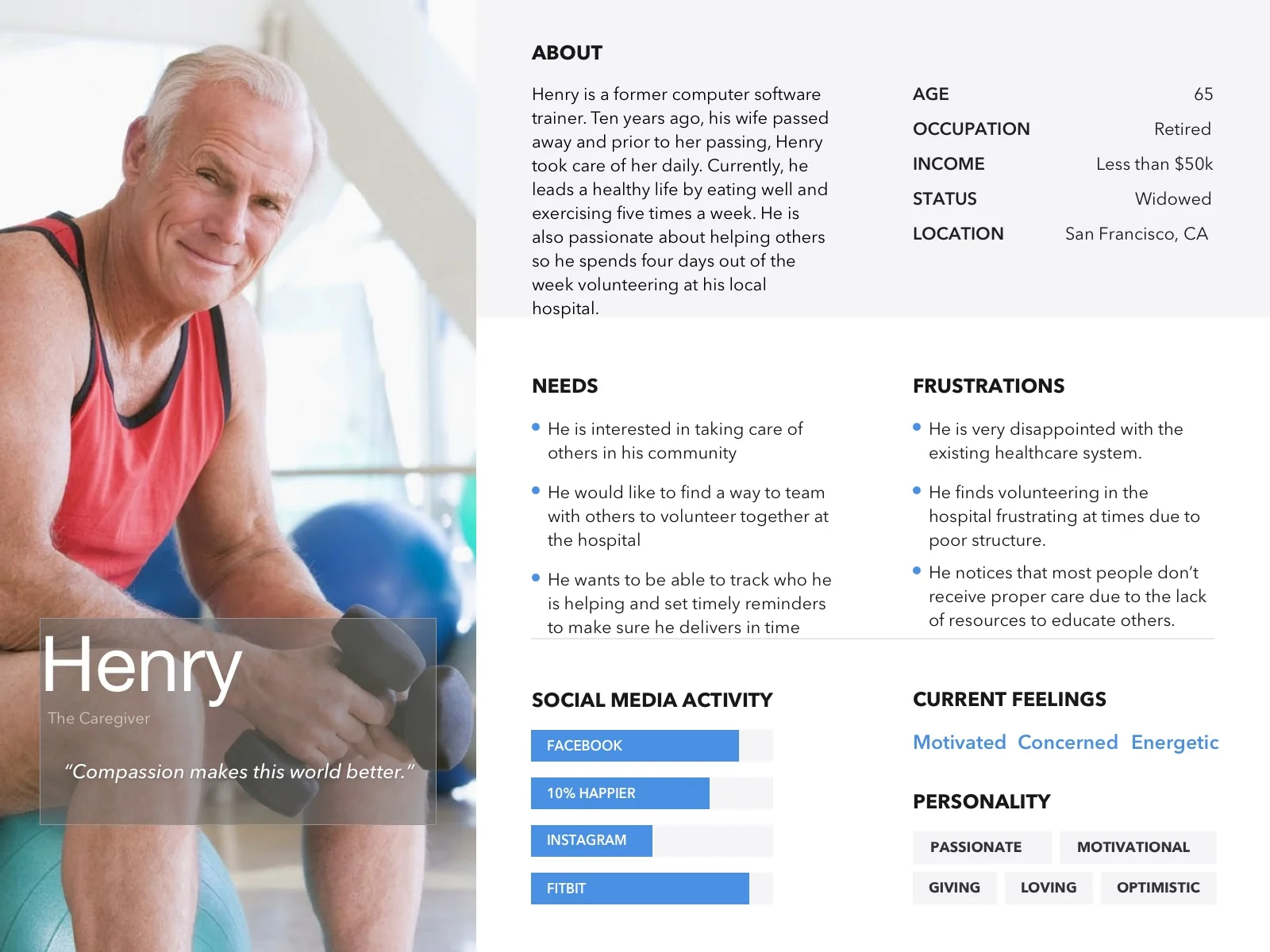
Once we gathered these insights into what our users felt about caregiving and care-receiving, I was able to create three personas for the target audience. Our primary persona is Henry who is the caregiver, the second is Omari who is the care-receiver, and third is Jennifer who is both the caregiver and care-receiver. The unique story and background of all three personas are a direct reflection of the users we interviewed and surveyed.
PROBLEM
People who need care are not aware of apps that can help them with their needs while providing a community to engage with others. While, people who would like to help are also not aware of apps that provide a community and list of people who need care.
SOLUTION
Design a simple yet engaging app for caregivers & care receivers that will use a matching system to match with each other for their respective needs.
SKETCHES
Before diving deep into Sketch to begin wireframing, we decided to brainstorm ideas on different user flows and sketch out some ideas. The user flows we focused on were: Creating a post, messaging a match and sending a reaction. After consulting with our client, we decided it was best to focus on the first two user flows and scrap the idea of adding reactions. Additionally, considering multiple ways to accomplish the same task, we also looked into creating another version of the user flow of messaging-a-match to test with our users.
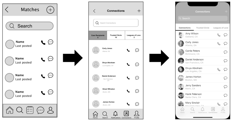
Another version of the Flow 2: Messages
WIREFRAMES
Even though our scope of project was to deliver either low fidelity or medium fidelity wireframes, we went above and beyond by producing a high fidelity wireframe as well as a visual composition. The low and medium fidelity wireframes went through multiple rounds of testing through each user flow.
The wireframe development progression on the Onboarding page
The wireframe development progression on the Home/Feed page
The wireframe development progression on Creating a post
The wireframe development progression on Connections/Messaging
The visual composition for Onboarding, Home/Feed, Post, and Connections/Messaging
ITERATIONS
Iterations are never simple as they require a great length of detail and are often the “meaty” part of the UX Design process, however, they are the most useful when explaining design decisions. Below are some of the major iterations that I noted throughout our journey.
Any noticeable progression through wireframes should and must always be explained through usability testing. Why? It’s all about the users satisfaction. We had 13 users test out our prototypes and asked them to express their thoughts during the process. While we jotted down their vocal thoughts, we paid particular attention on their body language as well to notice signs of delight, confusion, surprise, and so forth. The usability testing proved successful in all rounds and I was able to explain our iterations to our client with rock-solid and detailed evidence (see below the Iterations).
Our final prototype to our client was the high fidelity prototype, not the visual composition. Access below the InVision link to test out the prototype yourself!
“Thank you so much for your dedication, perseverance, and hard work...no words can describe the exceptional job you guys have done and the amount of empathy towards your craft.”
Each and every step of the way, we encountered many “aha” moments and made sure to convey them to our client. Below is a list of those “aha” moments turned into next steps that involve innovative and fun additions for Vytality Health:
Develop the care-receivers profile and their user flows to see their journey
Because many care-receivers are not tech-savvy, we recommended creating an option for caregivers to manage profiles of care-receivers with their permission
Create an accessible version of interface for users that need larger text to read, microphone ability in each flow that involves writing, and more
Have Vytality Health provide a Certification of Trust to caregivers to be “verified” for care-giving
Build a Matching system on: location, profile details, time of availability, and types of posts made over time
Add a feature on the home/feed page that would let the user filter what kind of posts he/she wants to see and from who vs. seeing all public posts
Within settings for editing profile, create a lock feature which lets user lock private information that he/she would not like to share with everyone (e.g.: age, location, etc.)
Caregivers receive “care points/hearts” for each time they complete a task for their care-receivers and this puts them at the “top” of list to be a caregiver
In 16 days, my team and I were able to accomplish a lot more than we imagined as we ran through the UX design cycle. Our client was absolutely delighted with our work and excited to ship our design for the December 2018 MVP launch.


