Zio Clinical Report
Zio's cardiac monitoring reports were built for cardiologists — but PCPs were the ones receiving them first. Dense clinical data and buried insights left primary care physicians uncertain, defaulting to cardiology referrals just to be safe. I designed an AI-powered cover page that sits at the front of every report, giving PCPs the confidence to triage accurately and independently — reducing unnecessary referrals and getting patients to the right care faster.
Overview
Inside ZioSuite — iRhythm's browser-based clinical portal — physicians review cardiac monitoring reports alongside their EHR workflow. The problem was that these reports were originally designed for cardiologists, not the PCPs receiving them first.
Dense medical prose buried the one question every PCP needed answered:
"Does this patient need a cardiologist, or can I manage this myself?"
The result was slow triage, low confidence, over-referral, and 8-week cardiology wait times for cases that often weren't serious.
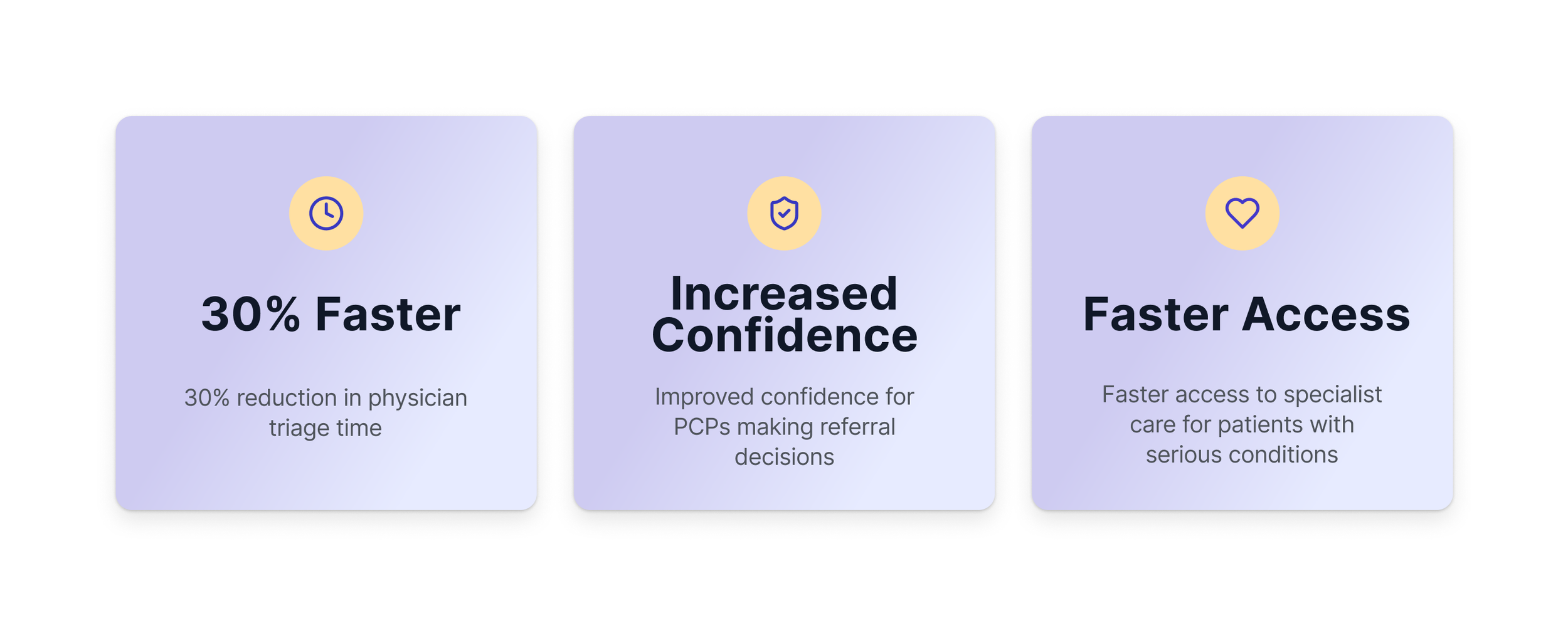
Impact
Background & Challenge
Only 43% of palpitations are cardiac-related — yet PCPs were defaulting to cardiology referrals for nearly all of them. Not because the findings were serious, but because the report made it impossible to tell.
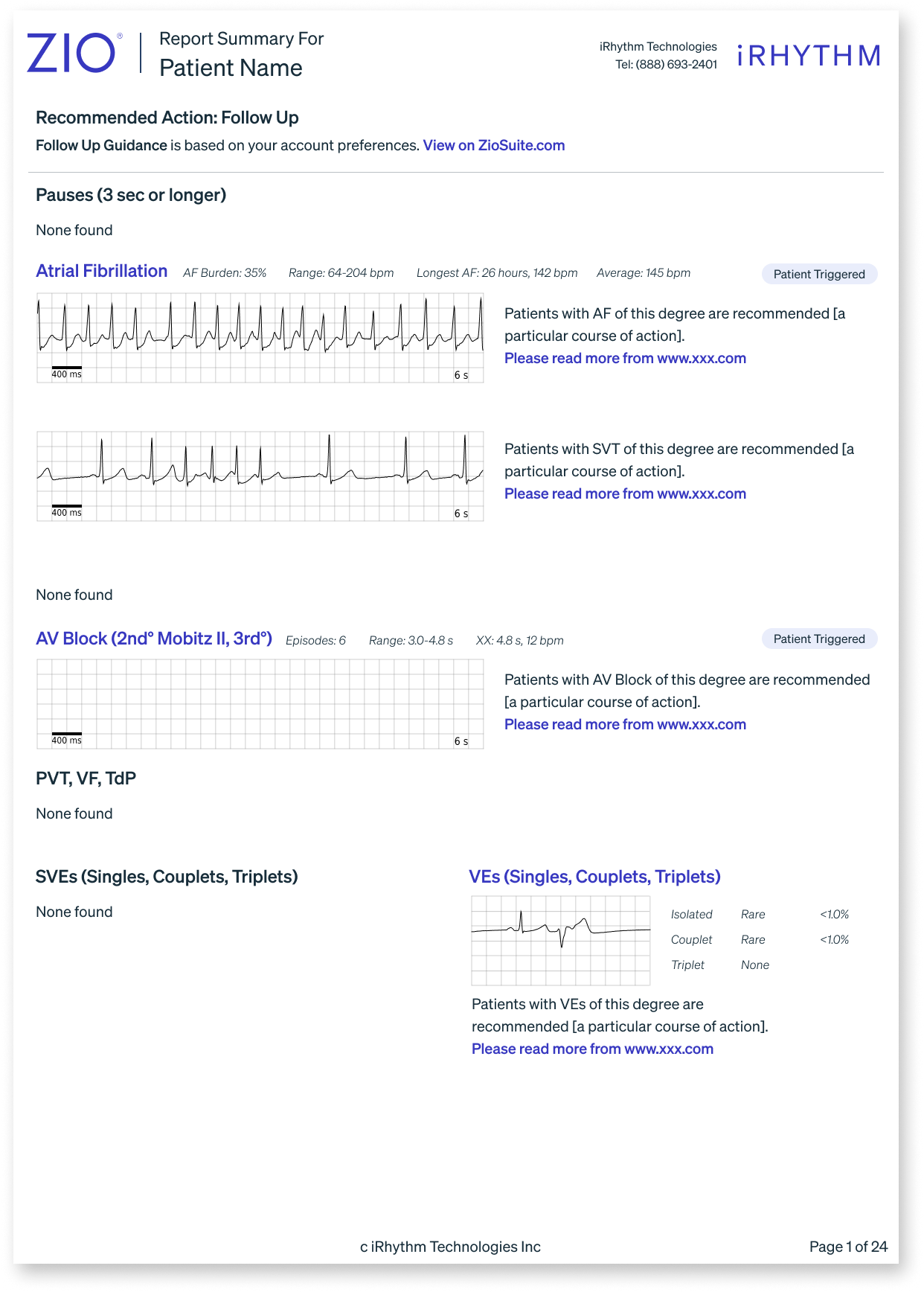
The existing Zio report was built for cardiologists. For a PCP reviewing results at 2am during a 12-hour shift, dense medical prose like:
"Atrial Fibrillation occurred (35% burden), ranging from 64–204 bpm, the longest lasting 1 day 9 hours…"
…offered no clear signal on what to do next. The data was all there — it just wasn't organized around the question PCPs actually needed answered.
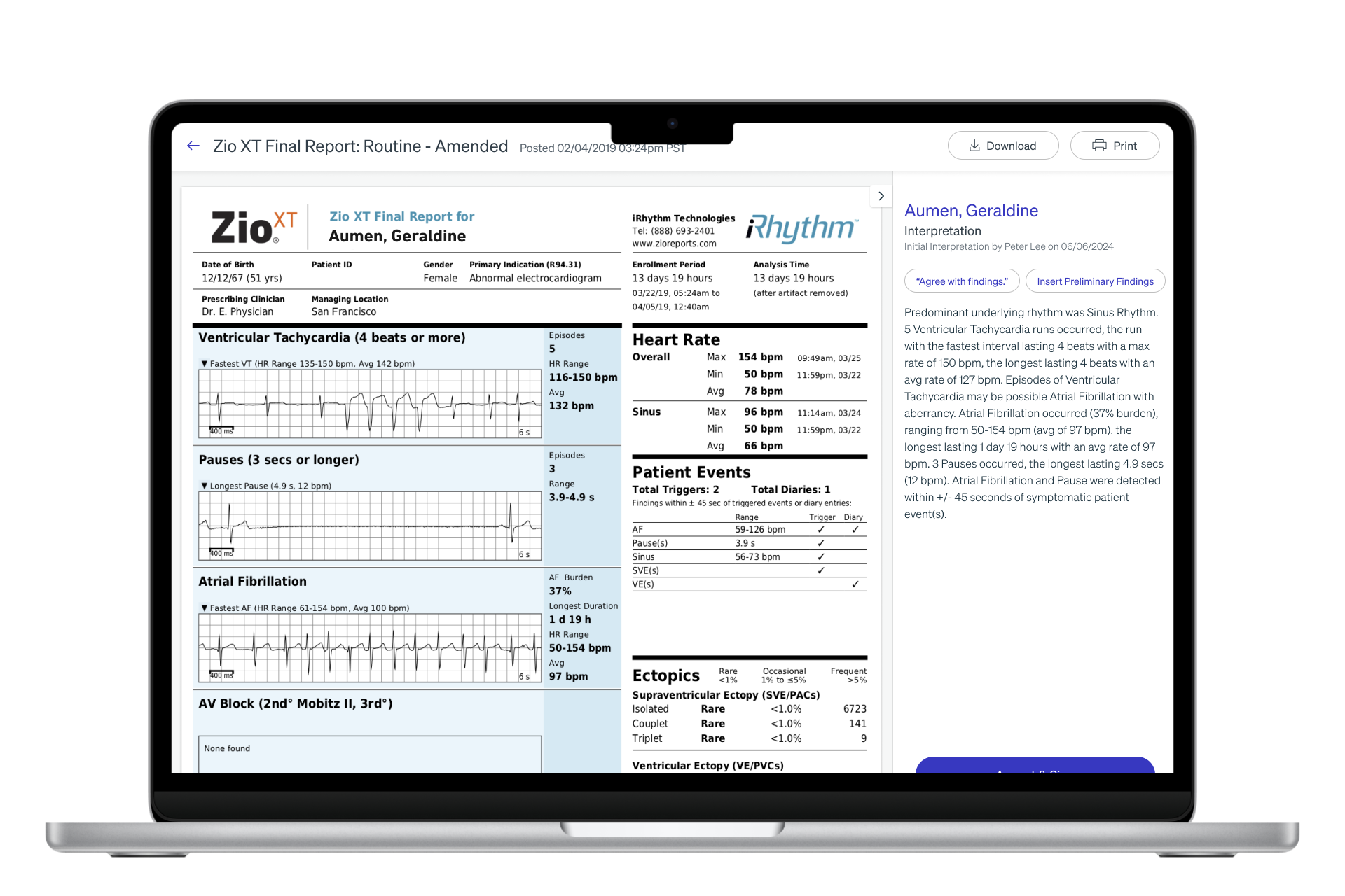
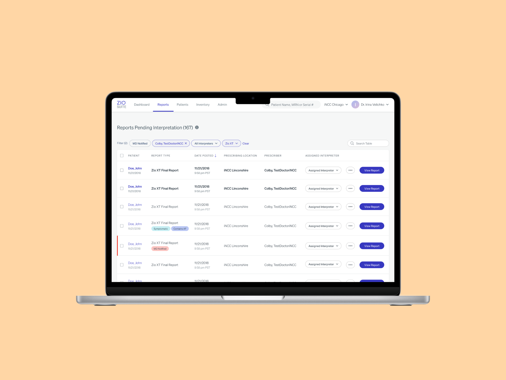
The original report in ZioSuite
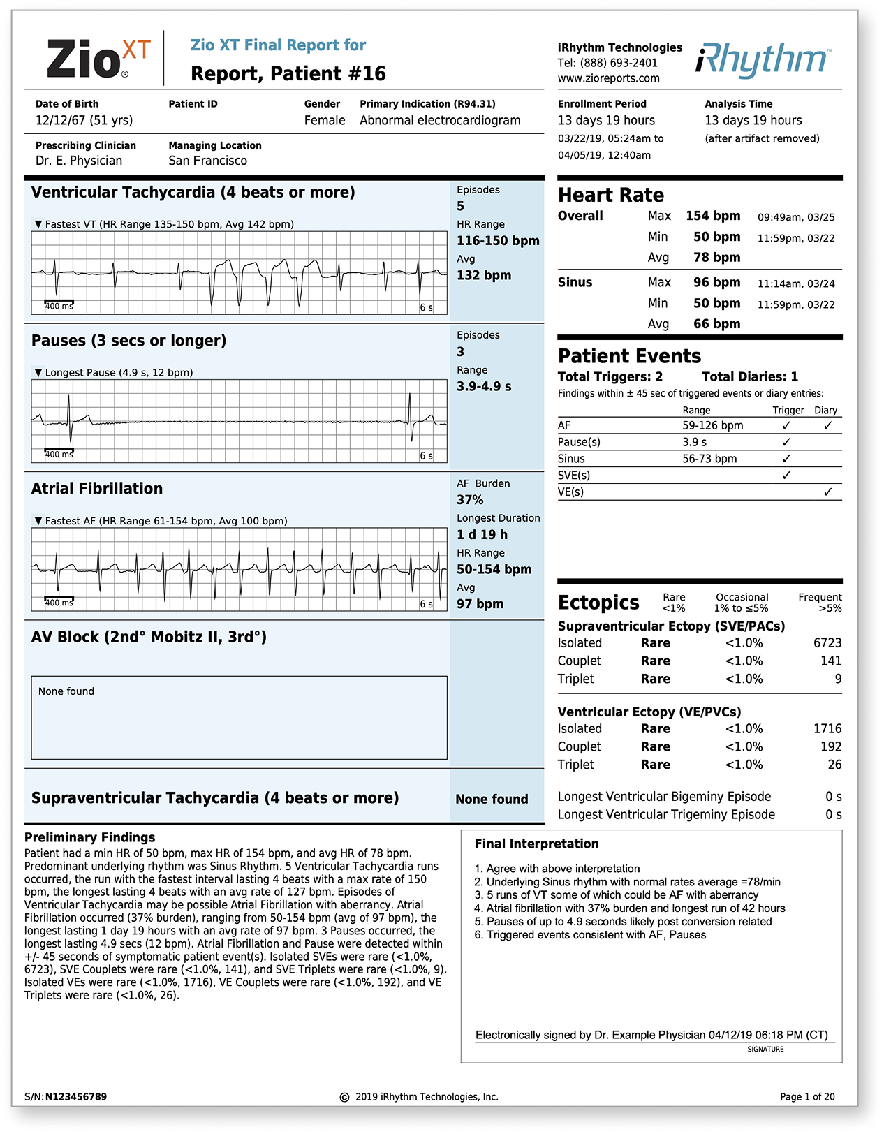
The original top sheet of the end-of-wear report
The Problem
PCPs
Slow interpretation, low confidence, defaulted to referrals
Patients
8-week cardiology wait times for cases that often weren't serious
Healthcare System
Over-referral wasted specialist resources
iRhythm
Limited primary care adoption, high support burden
UX Research
Research Goals
Understand how PCPs and cardiologists interpret Zio reports differently, and what information each needs to make confident triage decisions.
Who We Talked To
7 physicians — both PCPs and cardiologists — recruited intentionally to validate that a single design could serve two audiences with competing needs.
What We Did
Usability testing comparing time-on-task with the original report versus new cover page iterations, across 12 rounds of design.
What We Found
- PCPs were spending significantly more time per report on one question: "Does this patient need a cardiologist?" — something that should take seconds
- Every institution triages differently — a one-size-fits-all threshold wouldn't work
- PCPs scan for the most serious arrhythmias first — confirming severity-based hierarchy was the right call
- A simple yes/no answer wasn't enough — physicians needed to see why a threshold was met to trust the recommendation
- Feedback volume dropping from 10+ requested changes to 2–3 told us we'd matched their mental model
My Role & Approach
My Contribution
As Lead Product Designer, I owned this project end-to-end — from defining the problem space to shipping the final design. I collaborated closely with the CMO, UX Researcher, Product Managers, Clinical teams, and Regulatory/Legal stakeholders, but all design decisions and direction were mine to drive.
Design Vision
One question guided every decision:
"Can a PCP look at this page for 30 seconds and know exactly what to do next?"
Approach
Progressive disclosure, minimal cognitive load, and a visual hierarchy that mirrors how clinicians actually reason — most critical first, supporting detail available but never in the way.
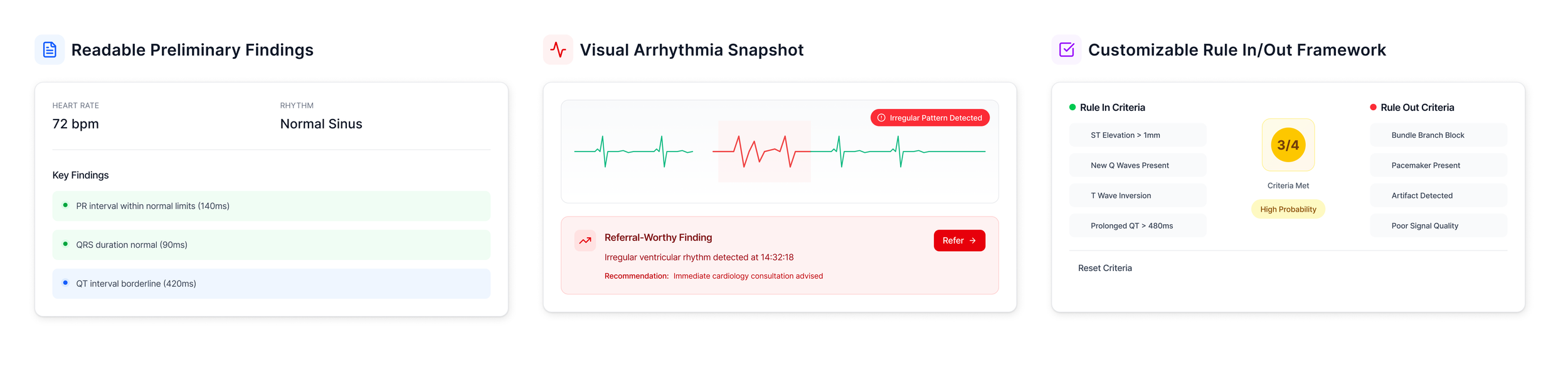
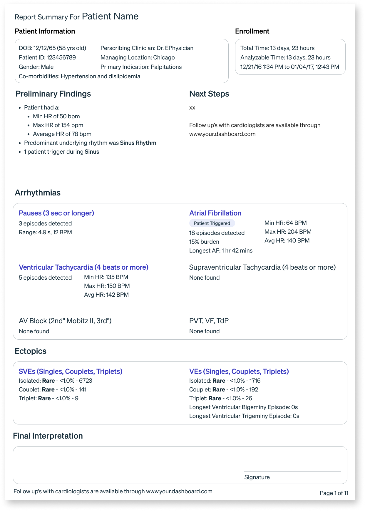
An example of my design solution in the initial phase
The Pivot
Midway through, the CMO advocated reframing the cover page for cardiologists — a significant shift from the original brief. The challenge? The existing report already worked well for cardiologists. The real gap had always been on the PCP side.
My Response: Rather than choosing one audience, I reframed the cover page as a dual-audience solution — PCP clarity on page one, clinical depth for cardiologists immediately after.
Solving for the less technical user upstream improves outcomes for the specialist downstream.
The challenge was to distill complex clinical findings into concise, actionable insights — all within a highly constrained space. This was a long-term, cross-functional effort, and Sharon was instrumental in ensuring that design decisions were both user-centered and feasible. She worked seamlessly with stakeholders across the business, advocating for clarity and usability.
Constraints
Designing under FDA regulatory requirements meant the visual language had to communicate urgency without alarming language or colors.
The Solution
User Flow
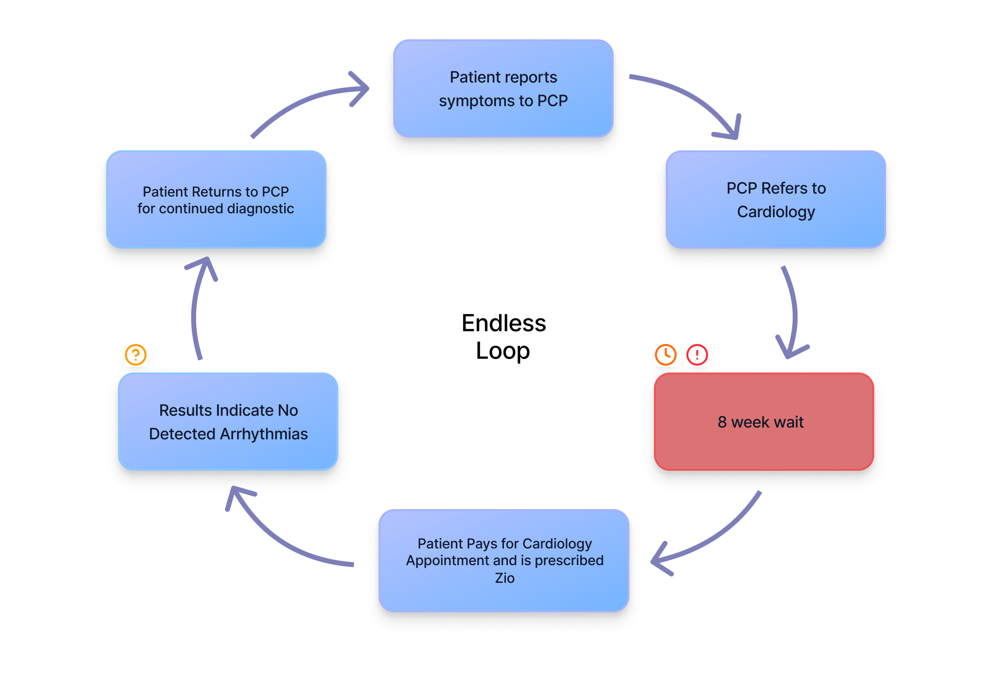
Without clear triage guidance, PCPs defaulted to referrals — creating an 8-week wait loop for cases that often weren't serious.
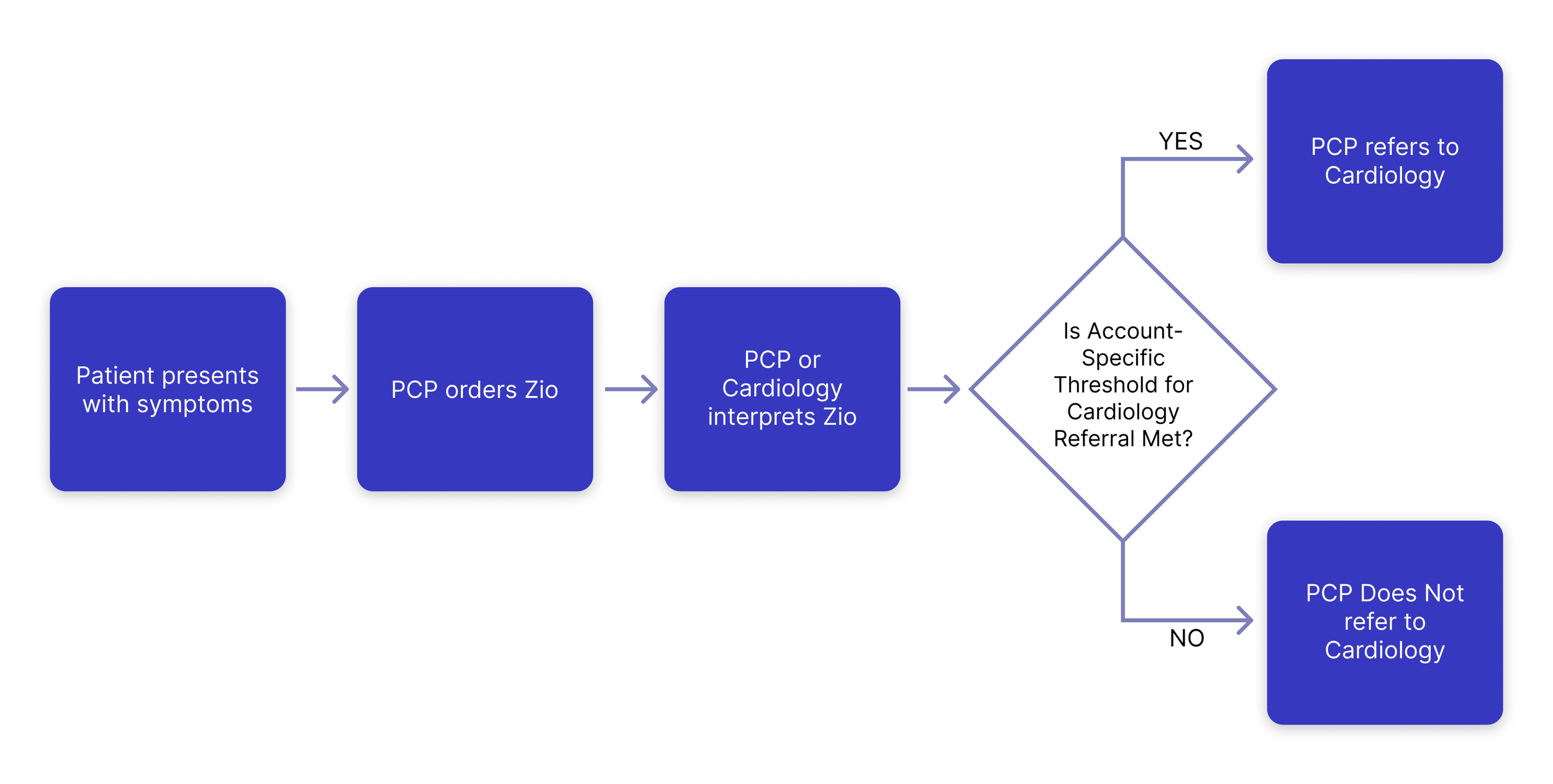
With practice-specific criteria surfaced on page one, PCPs can make confident referral decisions independently.
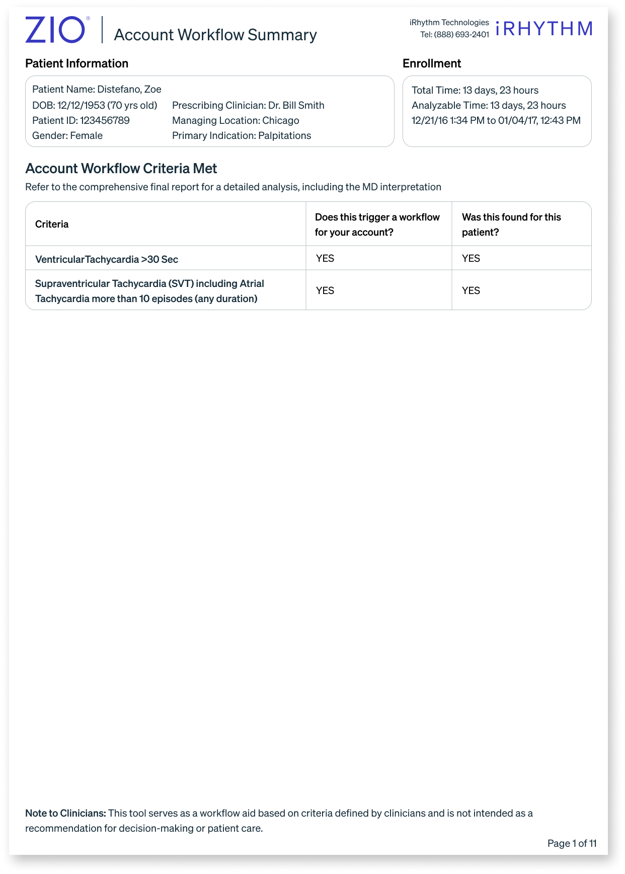
Forms
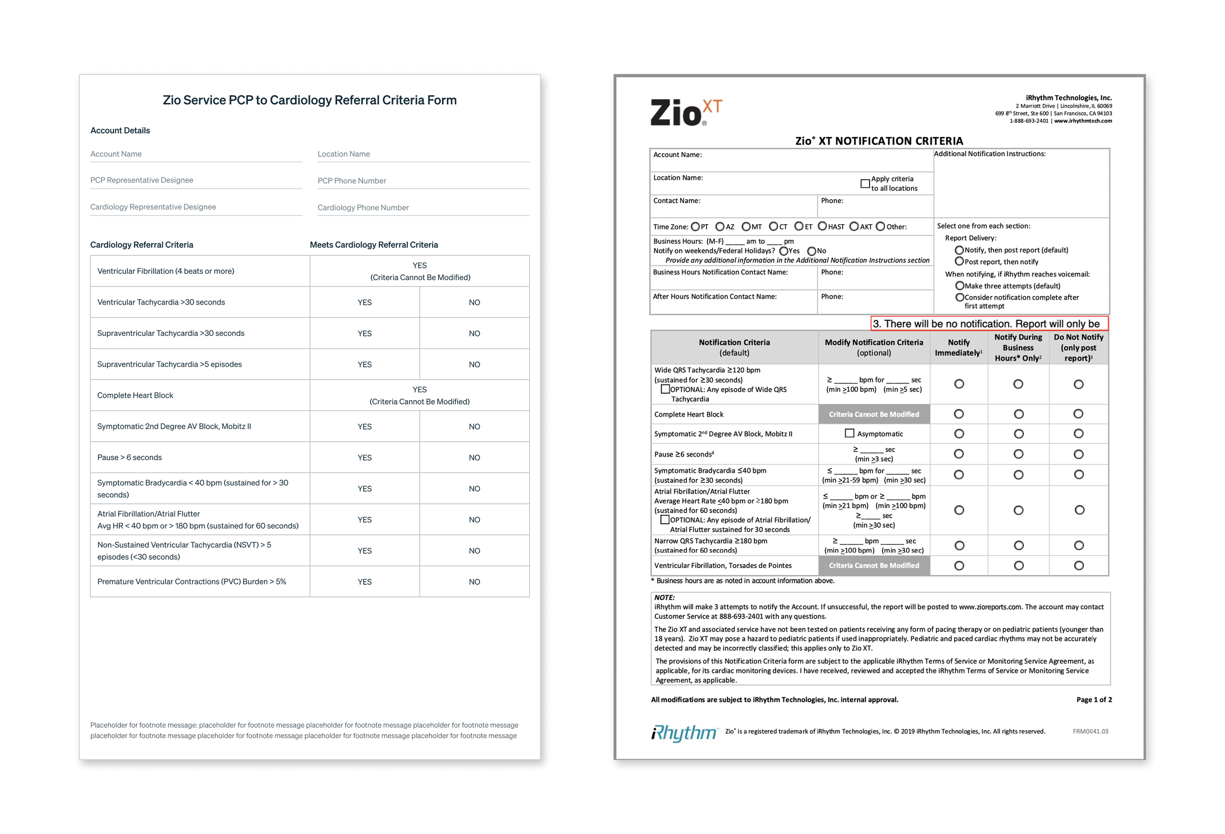
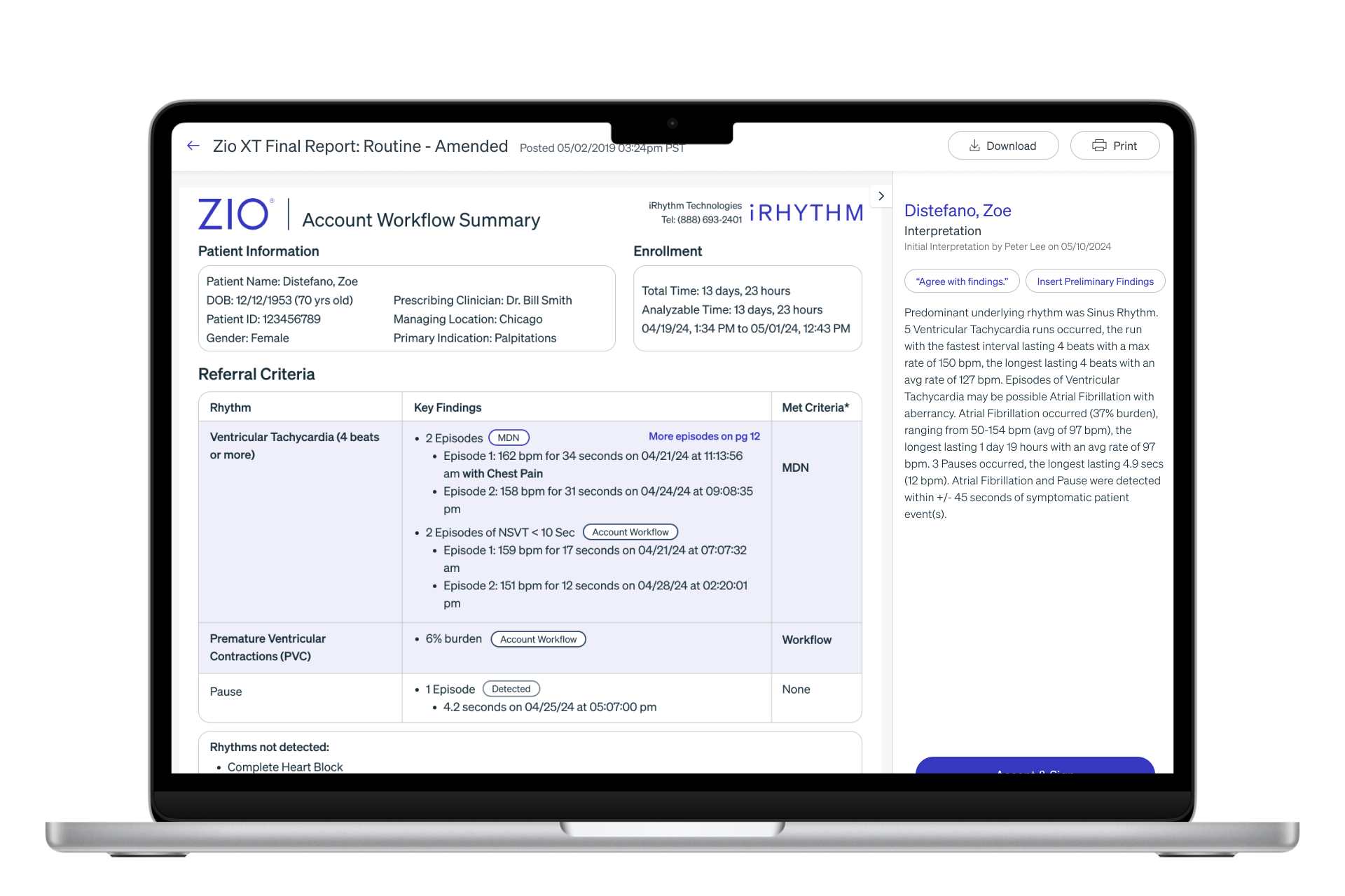
The Cardiology Referral Criteria Form (left) captures what warrants a specialist referral. The MDN Notification Criteria (right) sets thresholds for urgent physician alerts during monitoring. Together they power the cover page.
The Cover Page
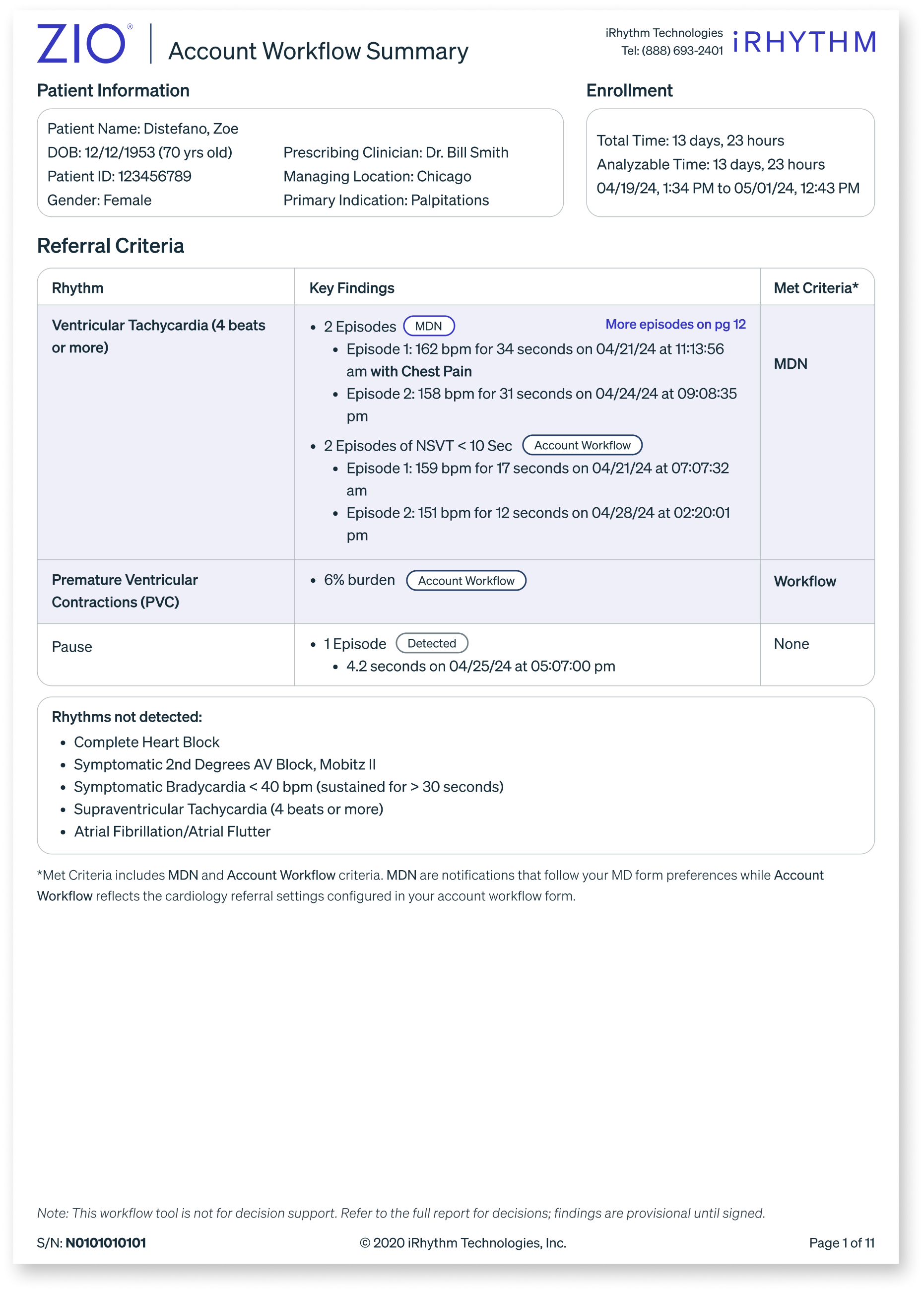
The final cover page design prioritizes clarity and clinical decision-making.
- Findings organized by severity — MDN notifications first, Account Workflow criteria second
- Each rhythm includes key detections, timestamps, and clinical context
- "Met Criteria" column instantly signals referral threshold status
- "Rhythms not detected" section helps PCPs confidently rule out conditions
- Disclaimer reinforces this supports — but doesn't replace clinical judgment
Data-heavy visualization
Alternative approach: Integrated summary

Simplified YES / NO approach
Adding context back
Tradeoffs
Technical
- Adds a page to a document clinicians are already time-pressured to read
- Two separate design systems that can fall out of sync over time
- Clinicians may skip the cover page and go straight to the familiar report
Scale
- More complexity — more edge cases, more QA, more maintenance
- Consistency risk — different configurations could produce conflicting outputs for the same patient data
- Requires ongoing governance that a fixed template doesn't
Audience Tension
- PCPs still encounter more detail than ideal — simplicity has a floor
- Cardiologists pay a navigation cost to reach information they want immediately
- Hierarchy is a design opinion — if it doesn't match a clinician's mental model, the whole system breaks down for them
Reflection
This project taught me that the most important design decisions aren't always visual ones.
When the CMO pivoted priorities mid-project, I paused to ask why the original problem existed in the first place. Solving for cardiologists alone would never fix the over-referral loop — the root cause lived upstream with PCPs who lacked confidence to act on what they were seeing.
That reframe became the core insight that shaped everything:
Designing for the less technical user upstream improves outcomes for the specialist downstream.
What I'd do differently
Push for explicit alignment on the primary user before investing in design exploration. The mid-project pivot could have been surfaced earlier with clearer stakeholder alignment upfront.
What surprised me most
A simple yes/no wasn't enough to build physician trust. Doctors needed to see why a threshold was met before they felt confident acting on it. Trust in AI-powered features is earned through transparency — not assumed.